Sandy Hills The new layout
Re: Sandy Hills The new layout
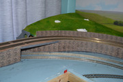
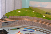
Purchased what I thought was a nice embossed stone paper for the embankment walls but think I will have to do it again because the printing is very repetitive and I don't think it looks right. Interested in any opinions from you chaps.


Sandy
- Walkingthedog
- Posts: 5000
- Joined: Thu Oct 04, 2018 5:51 pm
- Location: HAZLEMERE, BUCKS.
- Contact:
Re: Sandy Hills The new layout
I am experimenting with some colour pencils. The surface is embossed I have found I can darken the lighter bits down. If it works this will save me some work redoing it all. Hoping the result will make it look more even and more smokey In for a penny in for a pound. 
Sandy
Re: Sandy Hills The new layout

Thats better I think it looks more like dirty granite now hope you agree. Just a bit of touching up to do.
Sandy
Re: Sandy Hills The new layout
By Jove, I think he's got it!
Looks much better Sandy.
Looks much better Sandy.
"Not very stable, but incredibly versatile." 
Re: Sandy Hills The new layout
Thanks for that Steve. I felt right fed up when I saw the result of the paper when it first went up. Coloured pencils are so useful sometimes.
Sandy
-
twalton1145
- Posts: 114
- Joined: Fri Oct 05, 2018 11:47 am
- Location: Coldstream, Scottish Borders
- Contact:
- Walkingthedog
- Posts: 5000
- Joined: Thu Oct 04, 2018 5:51 pm
- Location: HAZLEMERE, BUCKS.
- Contact:
- bulleidboy
- Posts: 2345
- Joined: Thu Oct 04, 2018 6:30 pm
- Location: Basingstoke, Hants
- Contact:
Re: Sandy Hills The new layout
I think it looks absolutely fine - but just a suggestion - would a heavily diluted black-wash darken it slightly?
Who is online
Users browsing this forum: No registered users and 3 guests